It’s Show Time, Folks!
 Words or pictures, pictures or words? This is the age-old argument for what works best in advertising.
We are all familiar with cliches such as ‘a picture is worth a thousand words’, and ‘actions speak louder than words’, but considering the little amount of time an ad has to communicate, a picture is invariably the quicker option. Plus there’s a strong argument to prove that consumers are becoming more and more visual, and less and less focused on literacy. People think using pictures. Dr. Lynell Burmark, writer of several books and papers on visual literacy, said: “...unless our words, concepts, ideas are hooked onto an image, they will go in one ear, sail through the brain, and go out the other ear. Words are processed by our short-term memory where we can only retain about 7 bits of information (plus or minus 2). This is why, by the way, that we have 7-digit phone numbers. Images, on the other hand, go directly into long-term memory where they are indelibly etched.” In most cases, it’s more interesting to show than tell.
So let’s have a break from words and enjoy some pure visual communication examples...

Kit Kat, JWT London

NIVEA night, TBWA/NEBOKO, Netherlands
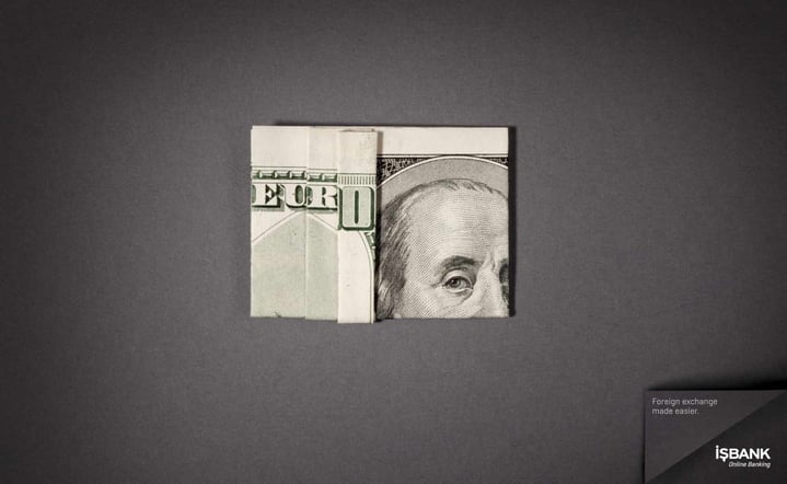
İşbank, Leo Burnett Brussels
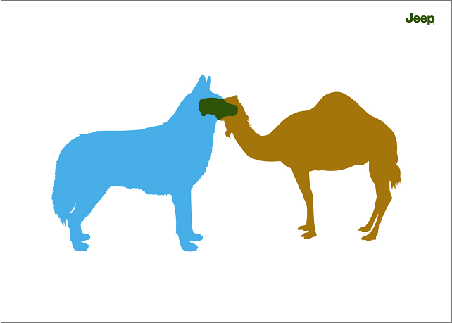
Jeep, BBDO Proximity, Malaysia

Mini Cooper, DraftFCB Argentina
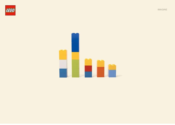
LEGO, Jung von Matt, Hamburg

FedEx, DDB Brazil
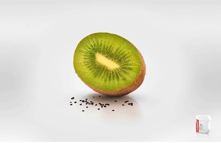
Colgate, Cerebro Y&R, Panama
Even Penguin Audiobooks and Scrabble use the power of pictures to sell – ironically – the power of words.
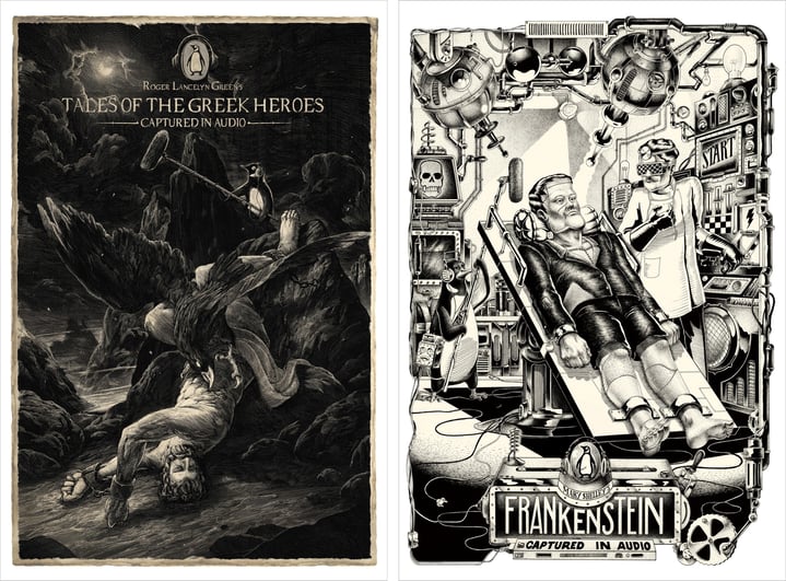
Penguin Books, Y&R, Beijing

Scrabble, Twiga, Kiev
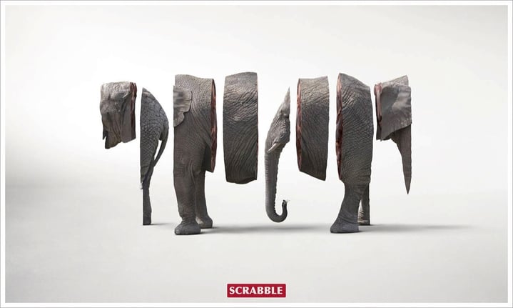
Scrabble, JWT Chile
Of course, pictures aren’t always more effective than words. Infographics work best using both. There are, however, times when words are more appropriate and/or more powerful, depending on what you want to say, how you want to say it, and to whom. The most famous example of this genre has to be The Economist campaign by BBDO London.
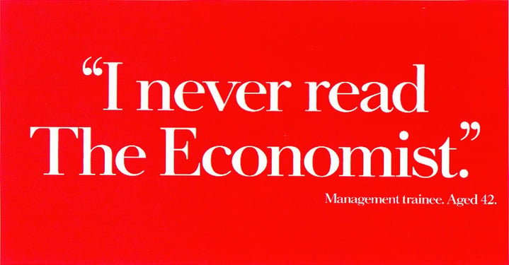
The Economist, BBDO London
The key is to remember that people aren’t stupid. You don’t always need to explain or even show every part of your idea to them. Leaving a bit for the consumer to figure out will engage them with your idea. That’s why imagination is perhaps the most powerful tool of all. So try not to show all your cards. Give them just enough information to be able to “fill in the gaps”. Don’t reveal, imply.
